
.png)
In modern society, sleep disorders have become a widespread problem, with more and more individuals experiencing the difficulties caused by insufficient sleep. According to the 2022 American Sleep Status Report by Casper-Gallup, one in three people believes their sleep quality is "average" or "poor." Are you part of this group troubled by sleep issues? Do you think that immense stress and anxiety are the only reasons for your difficulty in falling asleep and waking up during the night? Of course not. While you are purchasing melatonin and other sleep aids in an attempt to relieve your sleep anxiety, the color of your bedroom is subtly exacerbating your restlessness. This is not an exaggeration; after reading this article, you will suddenly realize and start creating a personalized space to improve your sleep quality!

How Do Bedroom Colors Affect Your Sleep Quality?
Visual Impact
Light itself has a wavelength, and the wavelengths that humans can see are limited. Different lengths of light waves present different colors, and the length of the light wave is directly related to the secretion of melatonin. Shorter wavelengths, such as blue and violet light, suppress melatonin secretion in our bodies and make it difficult to fall asleep, while longer wavelengths, such as orange light, promote melatonin secretion to induce drowsiness. This is why doctors do not recommend staying up late to play on phones, but rather advise turning off the lights early to sleep! Not only does staying up late to play on your phone deplete your energy, but it also causes you to have difficulties falling asleep, as the blue light emitted from phones interferes with melatonin secretion in the retina. Although black has no wavelength, the photoreceptors in the retina cannot perceive the presence of light in a completely dark environment, which removes the inhibition of melatonin and promotes sleep.
Psychological Effects
You may have heard of cool tones and warm tones. In color psychology, colors are often classified into cool tones, warm tones, and neutral tones based on their different effects on people's feelings. Warm tones usually evoke feelings of happiness, passion, and warmth. For example, red is commonly associated with love; orange resembles the afterglow of sunset, and yellow reminds one of the scorching sun.
On the contrary, cool tones evoke a sense of calmness and coolness. As for neutral tones, basic colors like black, white, and gray give off a feeling of balance and sophistication. This shows you how colors subtly affect your brain through psychological effects, which explains why most fast-food restaurants use red and yellow as the main colors of their interior decor.
Empirical Research
Is there any scientific evidence regarding the impact of color on sleep? The American Sleep Foundation points out in the article "What Color Helps You Sleep?" that the color of a bedroom may influence sleep through emotional changes. For example, blue is associated with calm waters and the sky, suggesting relaxation and safety; green relates to nature, while white helps people clear their minds before sleep as it is often associated with peace and tranquility to provide a sense of security. These colors subtly influence our ability to fall asleep through the emotional responses they evoke.
Travelodge, a hotel chain in the UK, did a study on 2,000 residents of different ages and found that blue bedrooms were the most conducive to sleep in among all colors, followed by yellow and green. Yellow evokes a feeling of warmth, while green has a nourishing effect on the body and mind. Meanwhile, red is overly stimulating to the brain, whereas white is too bright and tends to remind one of a work environment, thus reducing the ease of falling asleep. Many other experiments and studies also highlight the impact of color on sleep.
Which "Sleep-Inducing Colors" Can Usher You Into Slumberland?
Color Attributes
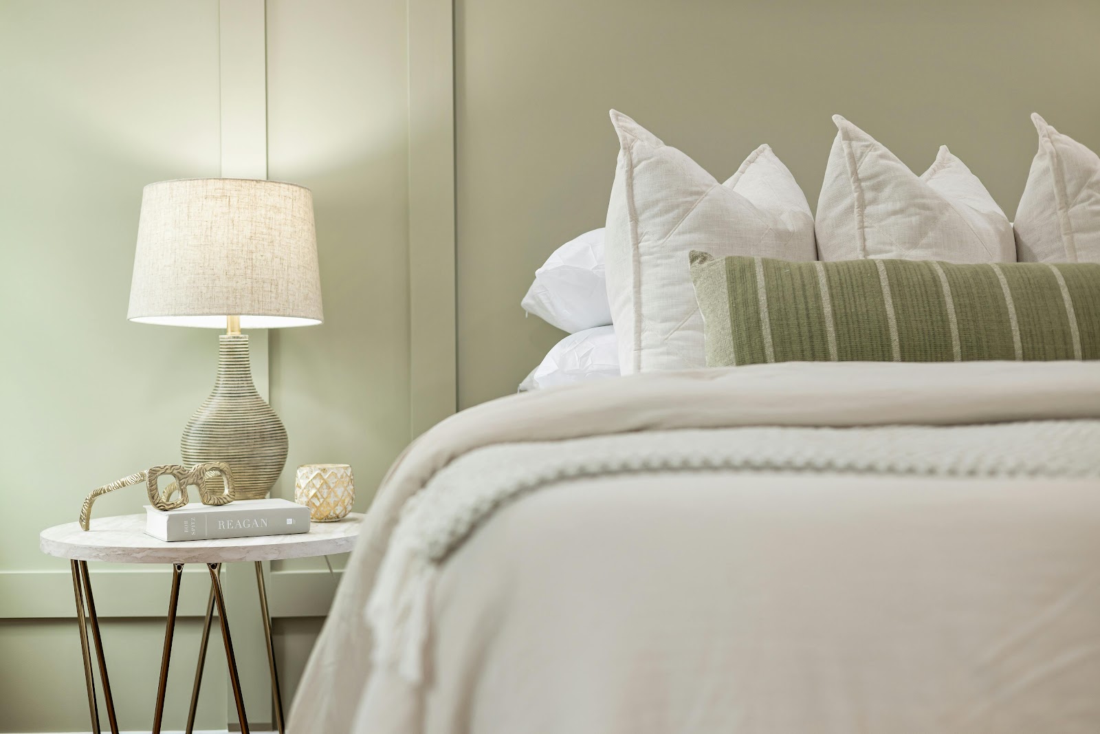
Color is comprised of three attributes: hue, brightness, and saturation. When it comes to hue, we recommend using warm yellow for warm colors, blue and green for cool colors, and off-white for neutral colors, as they give off a sense of comfort.
As for brightness, bright colors are highly recommended as they give off a clean, bright, and spacious feel, which can easily evoke positive emotions. In contrast, dark colors create a depressing and tense atmosphere, making people feel down and gloomy.
Concerning saturation, less saturated colors are easier on the eyes, whereas oversaturated colors can be too intense, and prolonged exposure can lead to fatigue and heightened tension.
Psychological Feelings
Colors have different interpretations, depending on social culture and personal experiences. For example, some people see yellow and think of the warm sun in winter, while others associate it with dangerous warning signs. From a psychological perspective, the color of a bedroom should primarily create a relaxing and stress-free atmosphere, with different color combinations varying from person to person. For most people, blue and green tend to evoke comfort. This is because blue often symbolizes freedom and tranquility and gives off a relaxing sensation, while green is commonly associated with nature, making it a therapeutic color that is calming to the eyes. Therefore, when choosing colors, it is important to consider those that help us forget about work and anxiety and evoke memories of beautiful things instead.
Empirical Research
In 2018, an experiment on color psychology conducted by the University of Basel in Switzerland observed 300 insomnia-prone individuals living in bedrooms painted blue, green, yellow, and red. The results showed that blue was more helpful in prolonging sleep time, with an average sleep duration of 7.1 hours, and a 10-minute reduction in average time taken to fall asleep compared to the red group. In 2015, the Max Planck Institute for Biological Cybernetics in Germany discovered, through eye-tracking, that when subjects looked at a green background, the frequency of accommodation in their eyes was 32% lower than when looking at a red background, leading to a significant reduction in fatigue. Physiologically, the cone cells in the human retina are most sensitive to green light, resulting in the least stimulation of the retina and minimal energy consumption, making green the color that most easily reduces fatigue.
A Guide to Bedroom Color Combinations for Improving Sleep Quality
Different Seasons
Different seasons often awaken people's desire for certain colors. For example, spring makes people long for pink and light yellow, while people crave refreshing blue and eye-catching green in summer. Meanwhile, autumn calls for caramel colors, whereas there is a yearning for warm yellow in winter.
Having the same decor in your bedroom day after day can lead to boredom, so why not spruce things up each season? You do not have to repaint your bedroom walls every few months, but small changes like reorganizing your bedroom furniture or mixing and matching accessories like rugs and curtains can certainly make a huge difference to how you perceive your bedroom!
In spring, try laying a light blue Persian rug in your bedroom and placing a few pink tulips in a vase on the table. The playful pink stands out against the blue tones, and whenever you enter your bedroom, it feels like stepping onto a grassy field covered with flowers, with the breath of spring rushing toward you. Moreover, this rug is easy to remove and machine-washable, making cleaning a breeze.
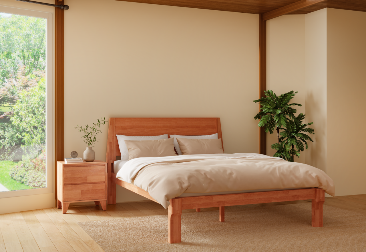
Additionally, try putting up a pair of light green curtains in the summer and pairing them with a Japanese joinery bed frame. We would even suggest placing some refreshing, wooden-scented aromatherapy sticks or candles in your bedroom. When the scent fills the air, you will feel calm and relaxed, as if you are lying down in a forest in the summer.
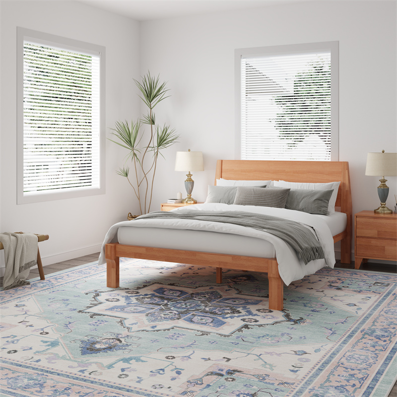
Furthermore, consider replacing your bed sheets with caramel-colored ones adorned with maple leaves in autumn. Of course, if you want a stronger autumn vibe, consider adding more solid wood furniture, such as a Walnut Nightstand.
Whereas, you can replace your bedding with white fluffy blankets and sheets in winter. Imagine lying on a comfy bed with a bedside lamp emitting a soft, warm glow while it is snowing heavily outside. With such a setup, it would be impossible for you not to dive into the blankets and fall asleep blissfully.
Different Groups of People
Earlier, we mentioned that the feelings evoked by each color vary from person to person. So, how should we match colors for anxious office workers, elderly people, and children?
Alleviating anxiety and insomnia is of the utmost importance for anxious office workers. Therefore, when choosing colors for a bedroom, we should prioritize those that relieve stress and promote sleep. For most people, blue, green, and light purple are good choices. Blue bed sheets can stimulate the brain to secrete melatonin, helping us fall asleep more quickly, while green curtains are less visually stimulating, which greatly alleviates eye fatigue and helps us to relax. Meanwhile, light purple walls remind one of the scent of lavender and offer a greater sense of security, which is especially suitable for women.
Elderly people tend to face issues like waking up at night frequently, having difficulty achieving deep slumber, and waking up early easily. Therefore, we recommended using a beige color scheme for the bedroom and complementing it with solid wood furniture. The soft tones of beige are less stimulating to the eyes, while the weighty appearance of wooden furniture visually enhances the sense of security. For a more comfortable experience, do check out recliners with massage and lift assist features! With just a simple press of a button, elderly users can enjoy the softness and comfort while standing up easily, making it ideal for reading a book or taking a nap.
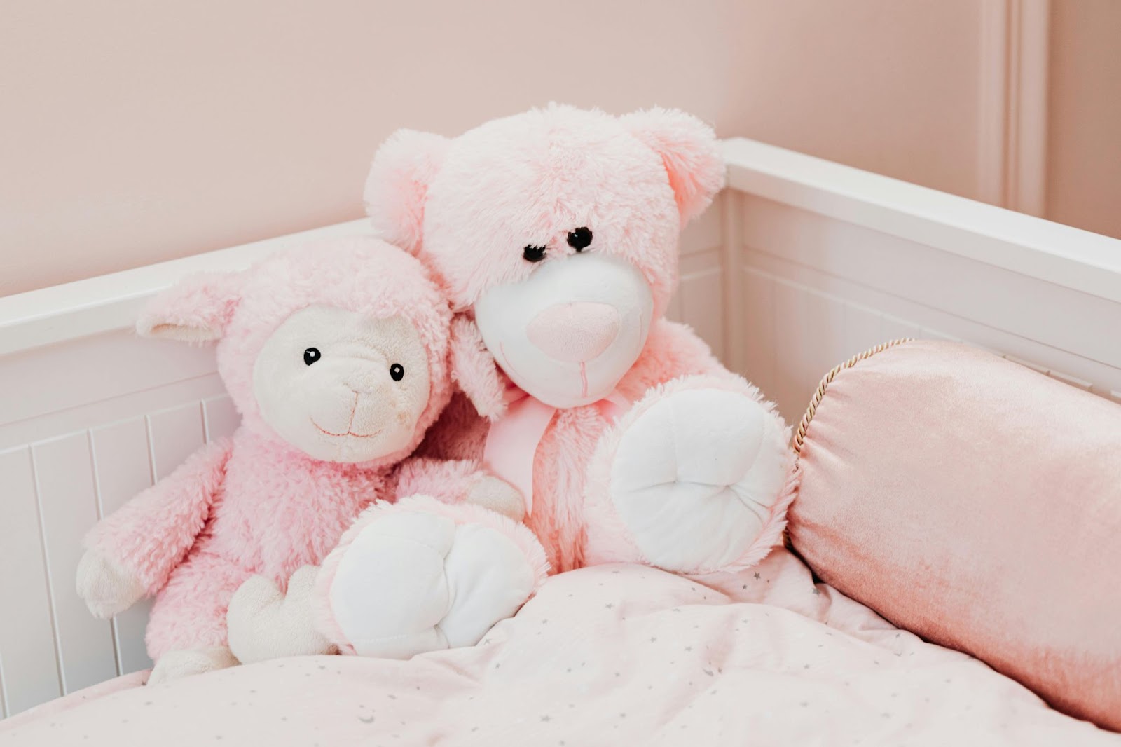
As for children, we recommend avoiding highly saturated colors in the bedroom, such as red and yellow, as they can excite the brain easily. Instead, try painting the walls with colors like light blue or light pink. You can also apply some stickers of your child’s favorite cartoon characters on the walls and place some plushies on the bed to make your child feel safe while sleeping.
Different Areas in the Bedroom
The goal of color matching in the bedroom is to achieve a unified tone, and the areas to take into account are the walls, the ceiling, and the floor. You can refer to the aforementioned color combinations to recolor your wall. As for the ceiling, we suggest installing lamps that emit warm yellow light instead of white light, as the former is softer and less harsh on the eyes. Plus, warm yellow light encourages the secretion of melatonin. You may also consider placing a soft and comfortable carpet on the floor to brighten up the atmosphere in your bedroom.
If you have a workspace in your bedroom, we recommend sprucing it up with some wooden furniture, such as a standing desk with a wooden tabletop. Not only does the natural texture and the rich color of wood enhance concentration and work efficiency, but they also complement various interior design styles well.
Of course, if your budget is limited or you don't want to make major changes, you can always start small. For example, changing the color of your curtains to less saturated gray tones (such as gray-pink, misty blue, or bean green) can reduce visual noise. In addition, adding some green plants and other natural elements, such as a few easy-to-care-for pothos plants, can add vitality to your bedroom and help relax your body and mind.
FAQ
1. Why is blue said to help with sleep, while blue light inhibits the production of melatonin?
First, it should be clarified that the sleep-inducing effect of blue comes from the visual impact and psychological effect of the color itself, whereas blue light inhibits melatonin secretion due to its short wavelength, which is unfavorable for sleep. Although blue objects also reflect blue light, this is not equivalent to the high-energy blue light with a short wavelength.
2. Which colors should be avoided in the bedroom, and what should you do if you really like those colors?
Red and deep purple are not recommended colors for the bedroom. This is because red is a highly saturated color that can stimulate the brain to enter a more active state, while deep purple can trigger depressive feelings in people, thereby increasing the frequency of nightmares at night. If you really like these colors, it is advisable to minimize their proportion in the overall visual space and only use them in small areas.
3. Does the material of a wall affect the impact of color on sleep quality?
Yes, it does. Latex paint is generally recommended, as its matte texture reflects light more softly, while the highly reflective surface of tiles can amplify the negative emotional effects of red or purple before sleep.